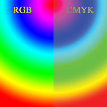
 What one sees on a computer display versus what can be typically printed shows the differences RGB vs. CMYK reproduction. There are differences between the ranges of colours that can be acheived in a printing system and what one can see on an electronic display advice. Different systems use different methods of image display. Most digital printing systems, like a laser or inkjet printer, print using cyan, magenta, yellow and black inks or toner. These systems use the ‘CMYK’ colourspace – the ‘K’ stands for ‘key colour’, which is black. Digital displays, and their analogue precedents, use a combination of red, green and blue, or ‘RGB’. Those colours combined generate the appearance of colour, white, grey or black.
These different colourspaces can show many of the same colours. But RGB goes much beyond the limits of what mixing the CYMK colours alone can acheive. For instance, a hot pink that looks ‘hot’ on a computer display will look muted when printed with a CMYK system.
Since some RGB colours are not reachable in the CMYK colourspace, software is used to help compensate. A software RIP (raster image processor) prepares the file for a CMYK printer. That software will ‘map’ the RGB colour value to the closest point in the CMYK space. This is true of any RGB colour that is outside of what CMYK can reproduce.
An RGB image that looks bright and colourful on a computer display or on a phone may look the same when printed. Or, thos colours may look dull compared to the original digital image. Altacolor checks for colour shifts and advises the client when possible with a comparison. Sometimes, the printed result is ‘close enough’ for the purposes of the client, sometimes, not.
EXPECTATIONS VERSUS COSTS in RGB vs. CMYK
When exact brand colours have to be matched, ‘spot’ colours are custom-mixed and printed in line with other colours, separately. This isn’t possible with digital print, but is possible, and done all the time, in screen-print. Printing spot colours requires extra steps which translate into extra costs. Whether an exact match to a particular colour is critical is a decision the client must make. This comes down to weighing cost factors against brand accuracy.
The expectations of the client in RGB vs. CMYK should be managed when simulating colours in CMYK. There’s no exact and absolute way to make a spot colour on a CMYK printer that will be a 100% match. Some colours aren’t acheviable at all, like bright greens, deep purples and very warm reds.
If the client has a competent artist, tools exist in Photoshop and similar professional image editing software that will allow a preview of an RGB image to CMYK. Then, it may be possible to alter the out-of-reach colours in the CMYK space to be something more acceptable, in line with the original design.
At Altacolor, we review all incoming artwork and apply a checklist, including effects of colour-shifting when moving from the RGB colourspace to CMYK.
MORE INFORMATION
For a very in-depth article on colourspaces, we recommend this article on Wikipedia. If you are a production artist or designer, you should make yourself very familiar with these concepts, since they have significant implications to your work. If you have technical, or other, quesions for Altacolor, reach out to us and we’d be glad to chat.